Week 3: Effective Data Visualizations
Objectives
Explain the importance of data visualizations. [CO 6]
Identify effective data visualizations. [CO 5]
Describe the five guidelines for effective data visualizations. [CO 5]
Next time… Demonstrate an ability to produce effective data visualizations to inform business and policy solutions. [CO 8]
Review Question 1
Which of the following is NOT one of the steps in the D3M process?
Define an objective
Analyze the data
Apply intuition
Communicate insights
Review Question 2
Which of the following is one of the reasons it is important to use data when making (important) decisions?
Gut instincts are often correct
Data analysis is less susceptible to biases
Data analysis is more susceptible to biases
Anecdotal evidence is more convincing when communicating insights
Agenda
Data storytelling
Why use data visualizations?
Guidelines for effective data visualizations
Data storytelling
Importance of storytelling
Storytelling is fundamental to human existence. We connect, share, teach and learn through stories.
Statistics provide evidence but we need stories to truly communicate the insights to the audience.
Our brains are predisposed to remember stories.
3 aspects of a data story
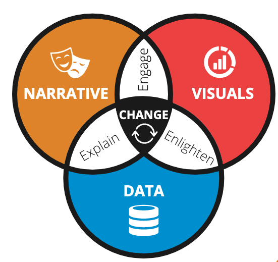
Source: Dykes, B. (2019). Effective Data Storytelling: How to Drive Change with Data, Narrative and Visuals (1st edition). Wiley.
Data story ≠ data visualization
While clear and appealing data visualizations are part of a data story, they are not data stories by themselves.
Data stories bring your analytical insights to life.
Side note: If you enjoy creating data stories, read more about data journalism.
Six elements of a data story
Data foundation
Main point
Explanatory focus (vs exploratory)
Linear sequence
Dramatic elements
Visual anchors
Examples
How my dad fishes for the future
Data Visualizations
Why use data visualizations?
Suppose I do some research on US government spending on a variety of public programs, including health care, Social Security, and others.
I find that Federal spending on health care and Social Security programs increased, but this was not the case for other programs.
Which of the following slides best tells this story?
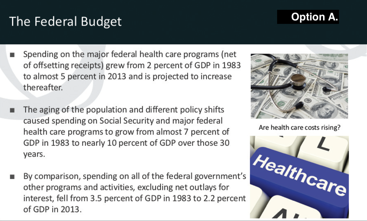
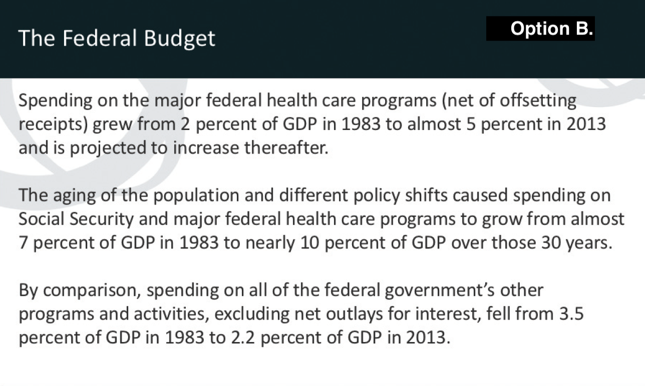


Which slide best tells our story?
A. B.
C. D. E.
Why use data visualizations?
Which of the slides best tells this story?
Why?
How else could you improve these slides?
Why use data visualizations?
What is the most important consideration when showcasing your work?
People will read, listen to, or see your findings.
Yet most of us spend very little time thinking about how to communicate our findings.
What are effective data visualizations?
We often spend days, weeks, months, or (sadly) years compiling and analyzing information for reports.
But most people spend minutes or hours designing the figures to showcase the data.
We might think people will just “get it” or that “the numbers will speak for themselves”
What are effective data visualizations?
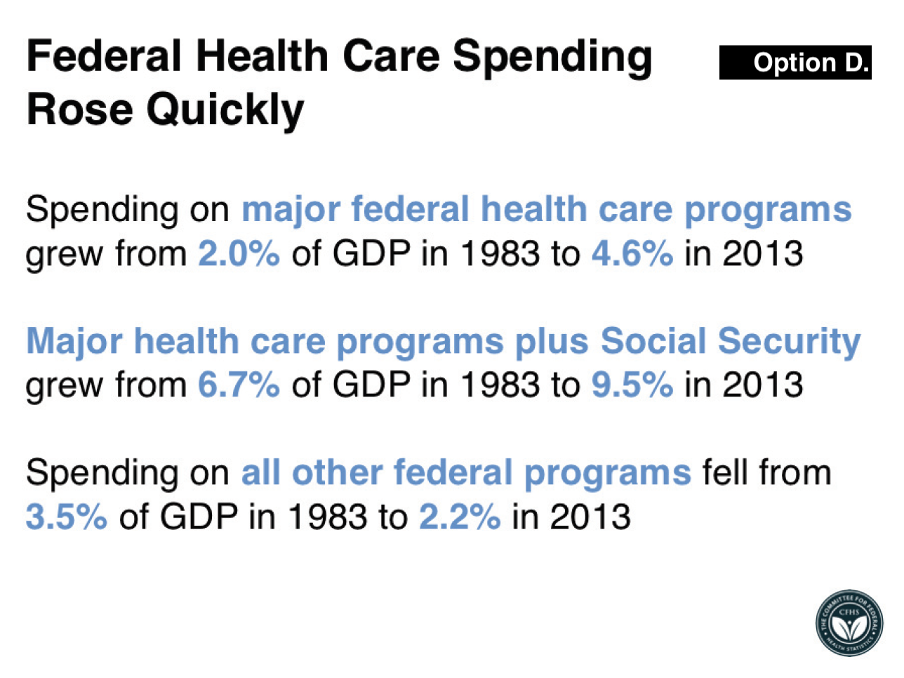
Which of the visualizations best tells our story about federal spending?
Recall: Federal spending on health care and Social Security increased, but this was not the case for other programs.
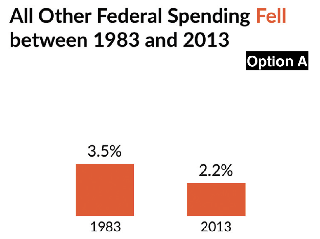
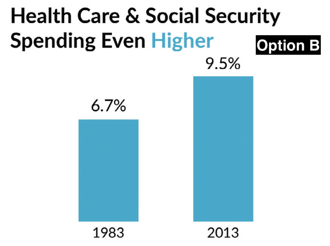
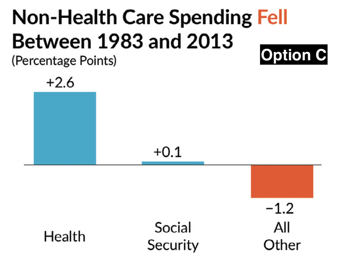
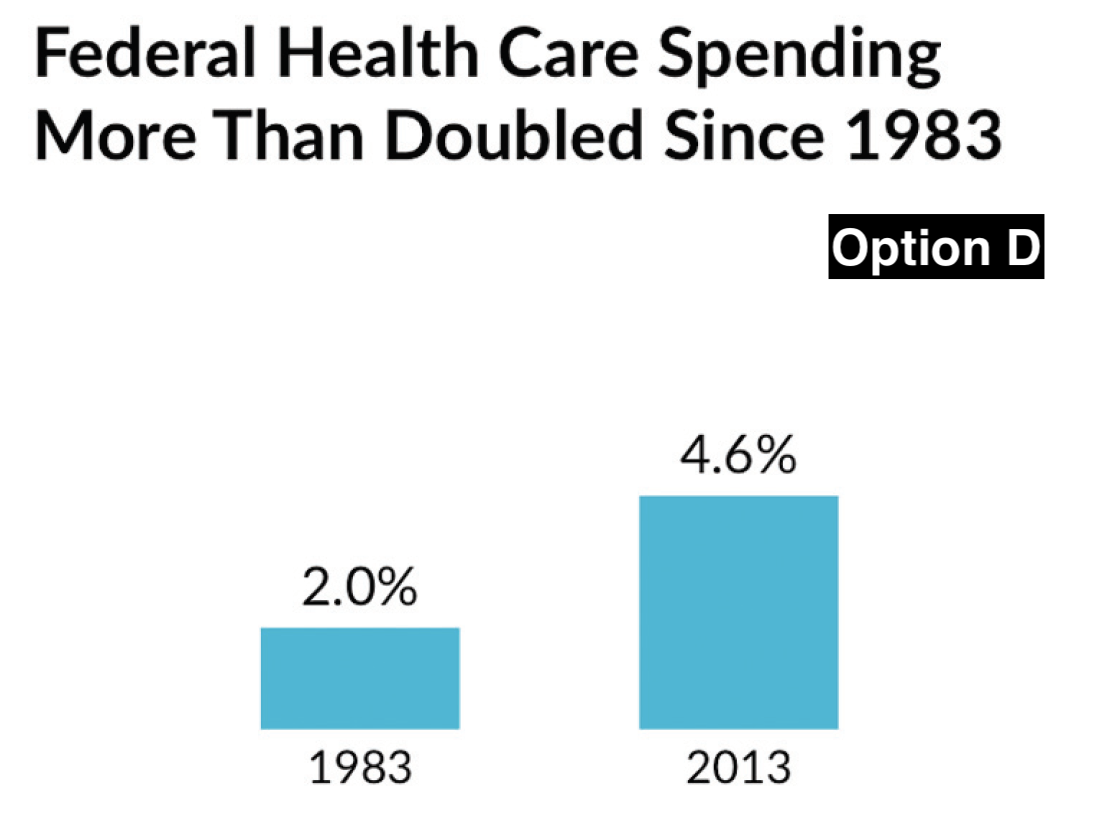
Which is the most effective visualizations?
A. B.
C. D.
What is an effective data visualizations?
Which visualization best tells this story?
Why?
How else could you improve these visualizations?
Guidelines for a better data visualizations
Identify your objective
Show the data
Reduce the clutter
Integrate the graphics and text
Avoid the spaghetti chart
Start with gray
1. Identify your objective
Before designing your visualization, answer these questions:
What do I want my figure to convey?
What do I want my audience to do with this message?
2. Show the data
Your audience will only grasp your point, argument, or story if they can see the data supporting it.
As visualization creators, our first challenge is deciding how much data to show and the best way to show it.
2. Show the data
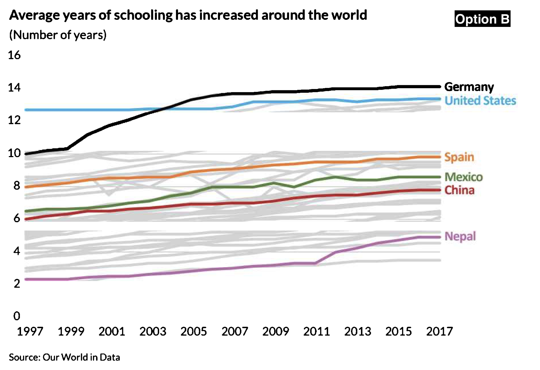
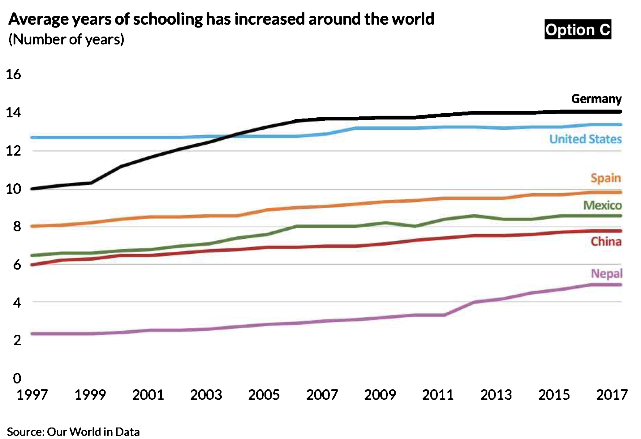
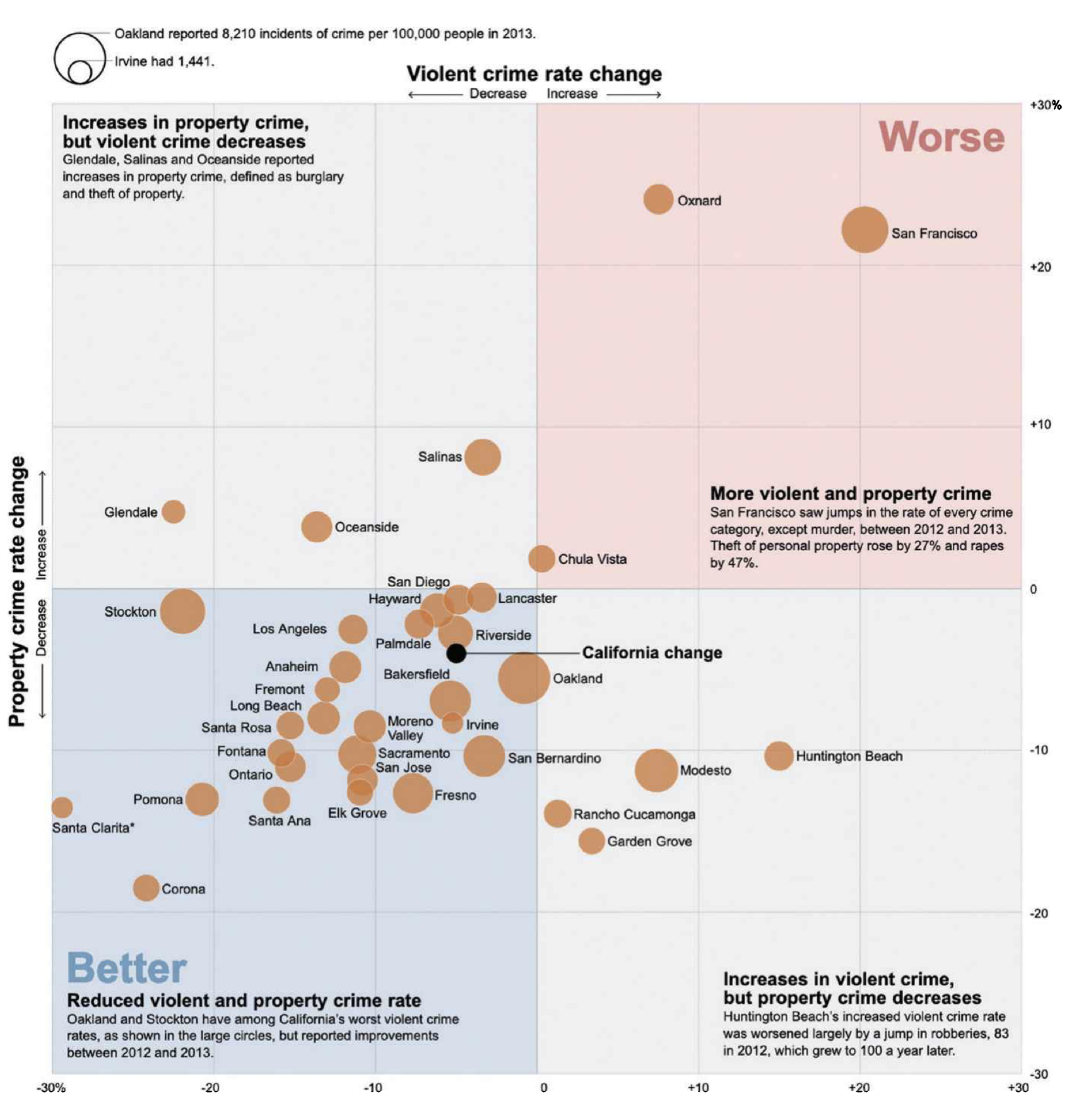
3. Reduce the clutter
The use of unnecessary visual elements distracts your audience from the central data and clutters the page.
Some examples?
- Heavy tick marks and grid lines
To Grid or Not to Grid
3. Reduce the clutter
The use of unnecessary visual elements distracts your audience from the central data and clutters the page.
Some examples?
Heavy tick marks and grid lines
Overlapping and overwhelming data markers
Why though?
3. Reduce the clutter
The use of unnecessary visual elements distracts your audience from the central data and clutters the page.
Some examples?
Heavy tick marks and grid lines
Overlapping and overwhelming data markers
Gradient colors or patterns, adding dimensions
No Thanks, Excel.
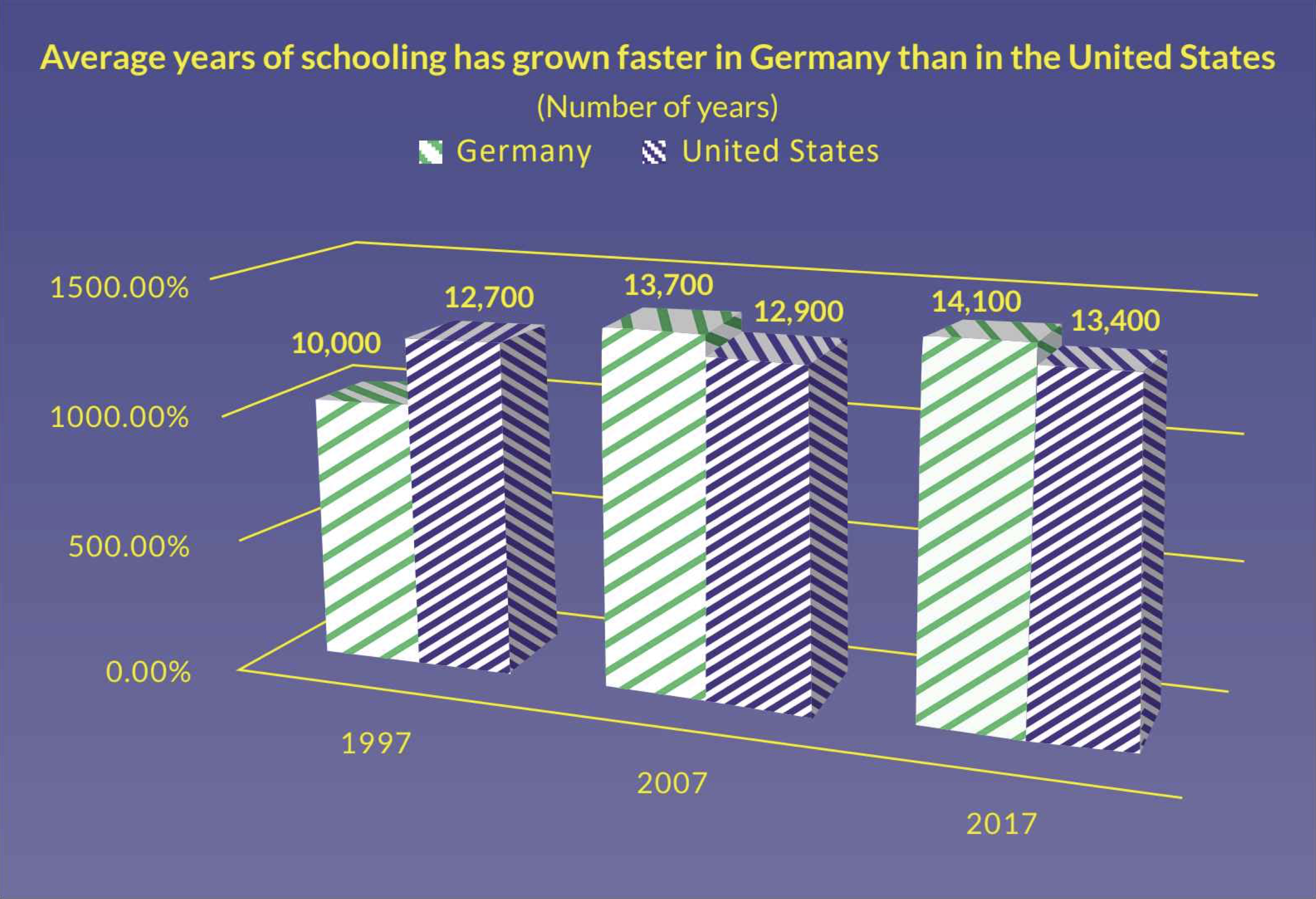
3. Reduce the clutter
The use of unnecessary visual elements distracts your audience from the central data and clutters the page.
Some examples?
Heavy tick marks and grid lines
Overlapping and overwhelming data markers
Gradient colors or patterns, adding dimensions
Too much text, too many labels, overkill!
Too Much.
3. Reduce the clutter
The use of unnecessary visual elements distracts your audience from the central data and clutters the page.
Some examples?
Heavy tick marks and grid lines
Overlapping and overwhelming data markers
Gradient colors or patterns, adding dimensions
Too much text, too many labels, overkill!
No thanks, Excel.
Simpler = Better
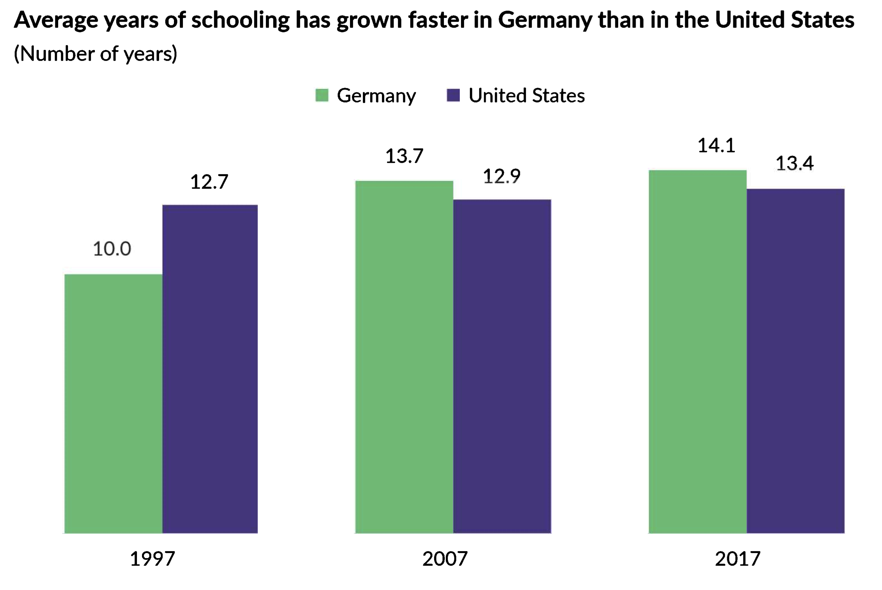
What changes would you make?
4. Integrate graphics and text
Our main focus when creating a visualization is on the graphical elements - bars, points, lines, etc.
But the text we include is often just as important. In fact, the included annotations are vitally important to audience comprehension.
4. Integrate graphics and text
3 ways to integrate text into graphs and visuals:
Remove legends
Create active titles
Add detail
Which vis do you like best?
Which vis do you like best?
Which vis do you like best?
Which vis do you like best?

Which vis do you like best?
A. B.
C. D.
Removing legends
Legends take up valuable space.
When possible, remove them.
Adding data labels directly on the chart makes it faster and easier to interpret and gives our data more space.
Active titles
Write your vis titles like a newspaper headline.
Your title should tell the audience what they should learn from your data.
Which title is more useful?
Add detail
Annotations allows audience members - especially those with less data vis experience - to grasp and understand the content quickly.
Colors draw the readers’ attention to key points and can differentiate between “good” and “bad.”
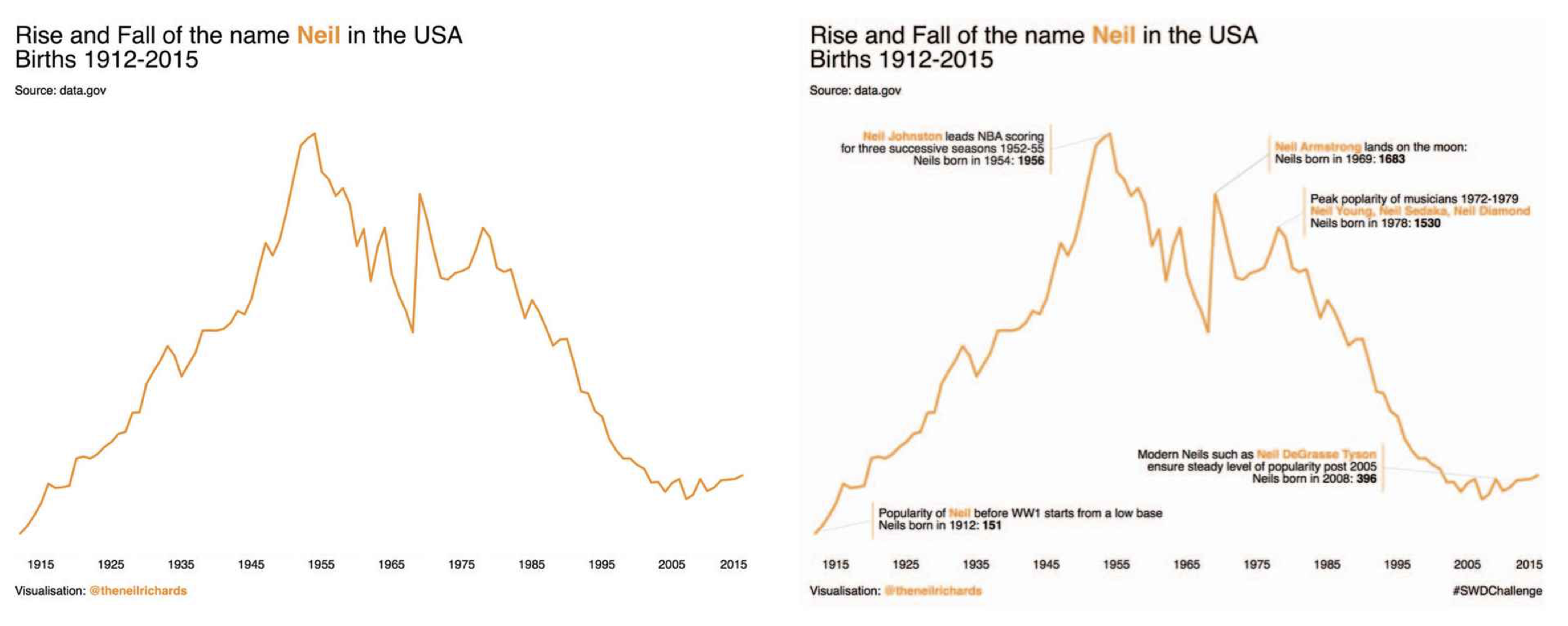
4. Integrate graphics and text
Recap:
Remove legends
Create active titles
Add detail
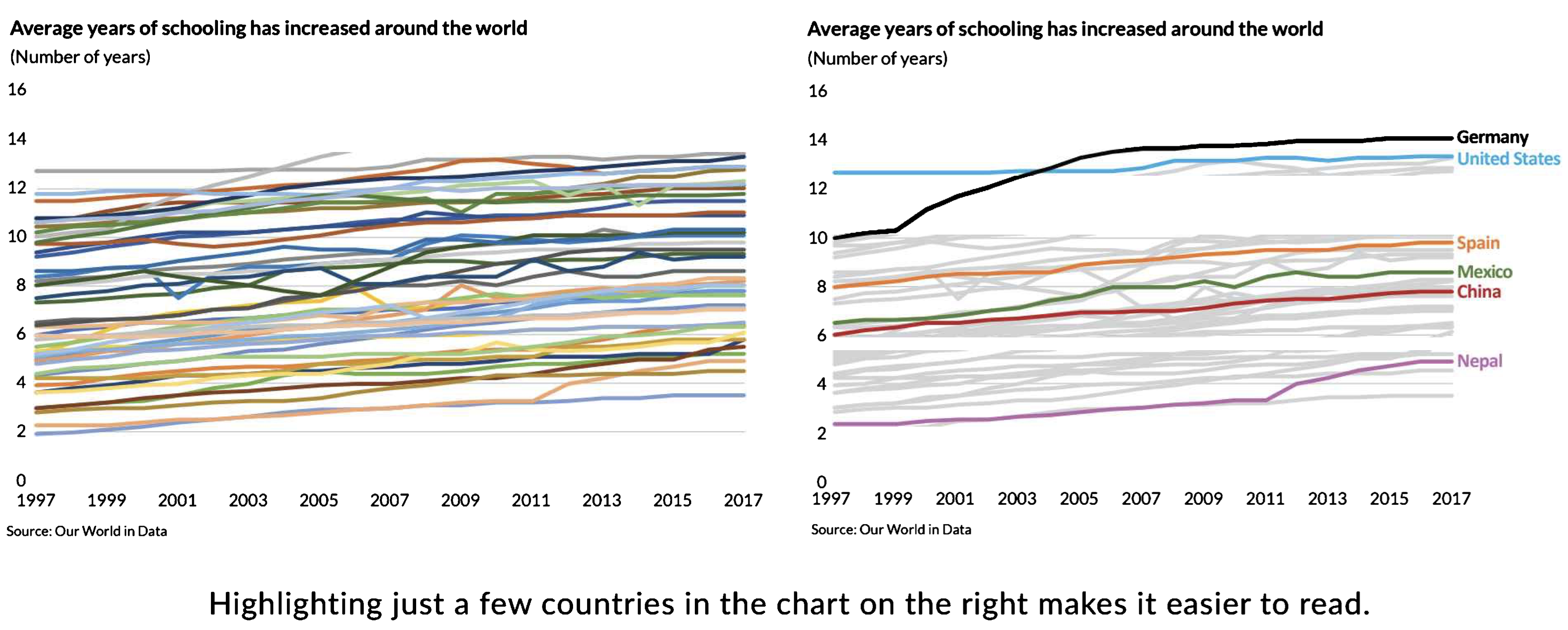
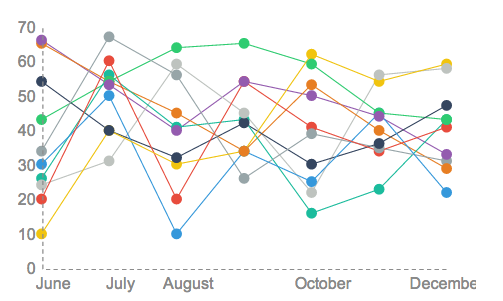
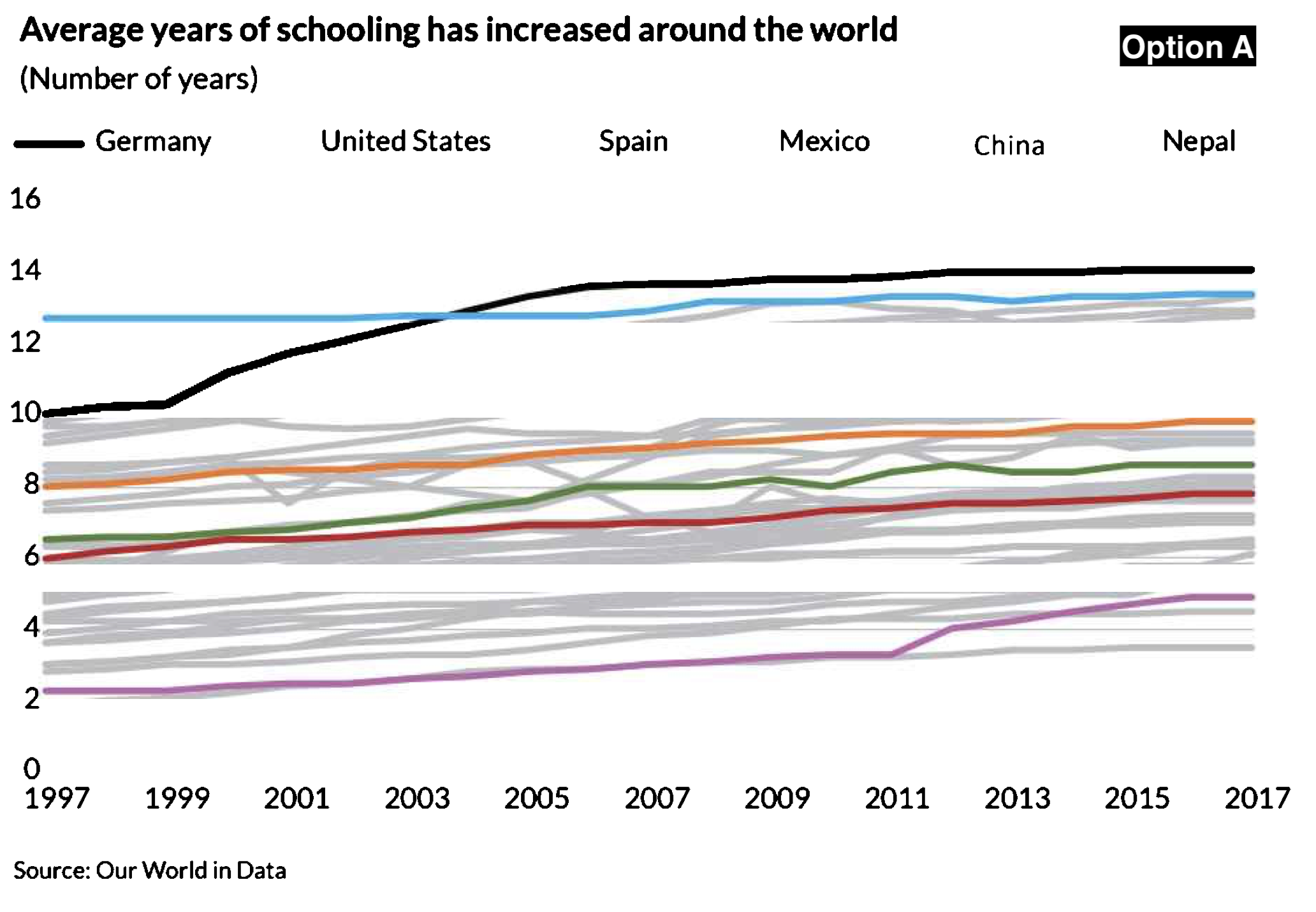
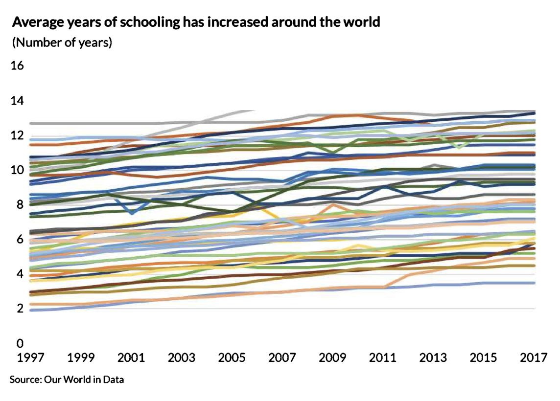
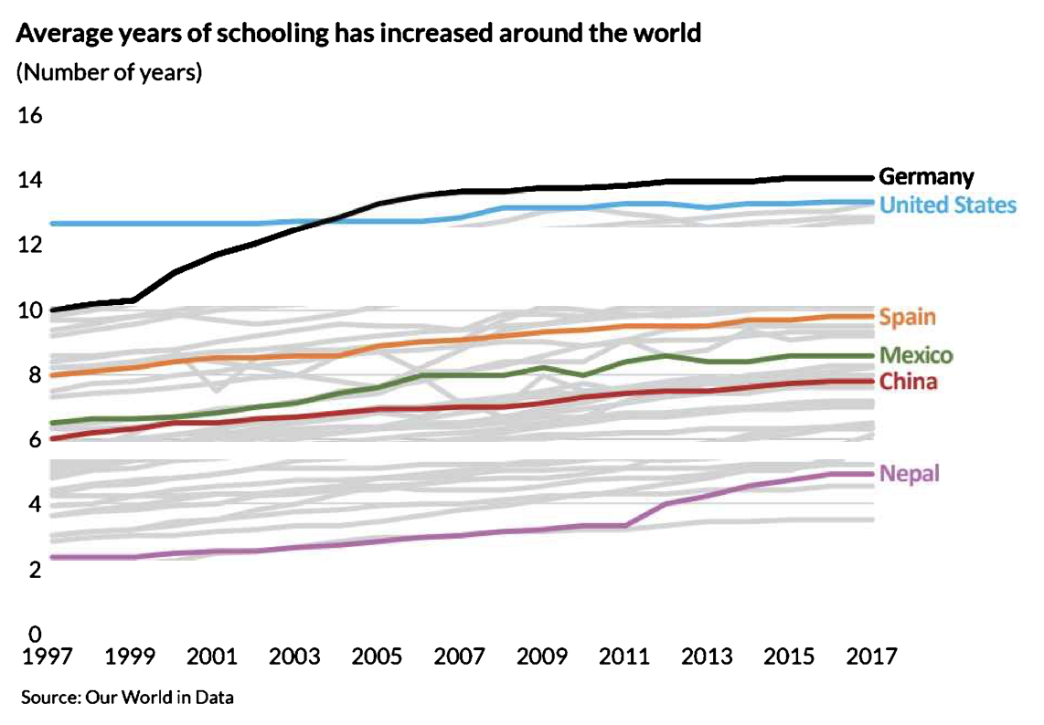
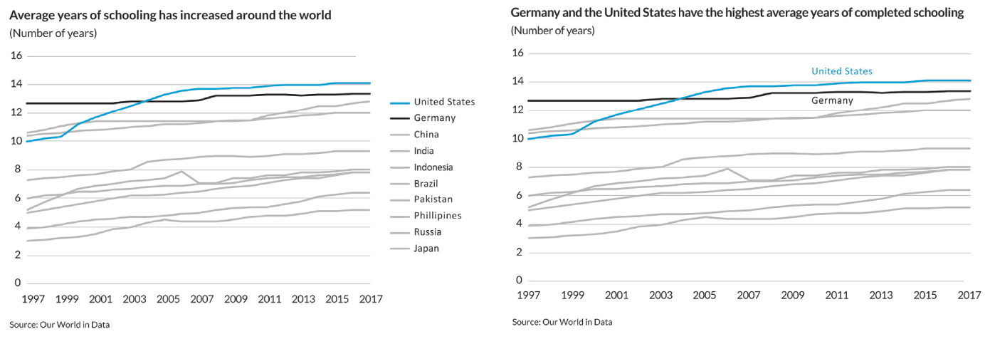
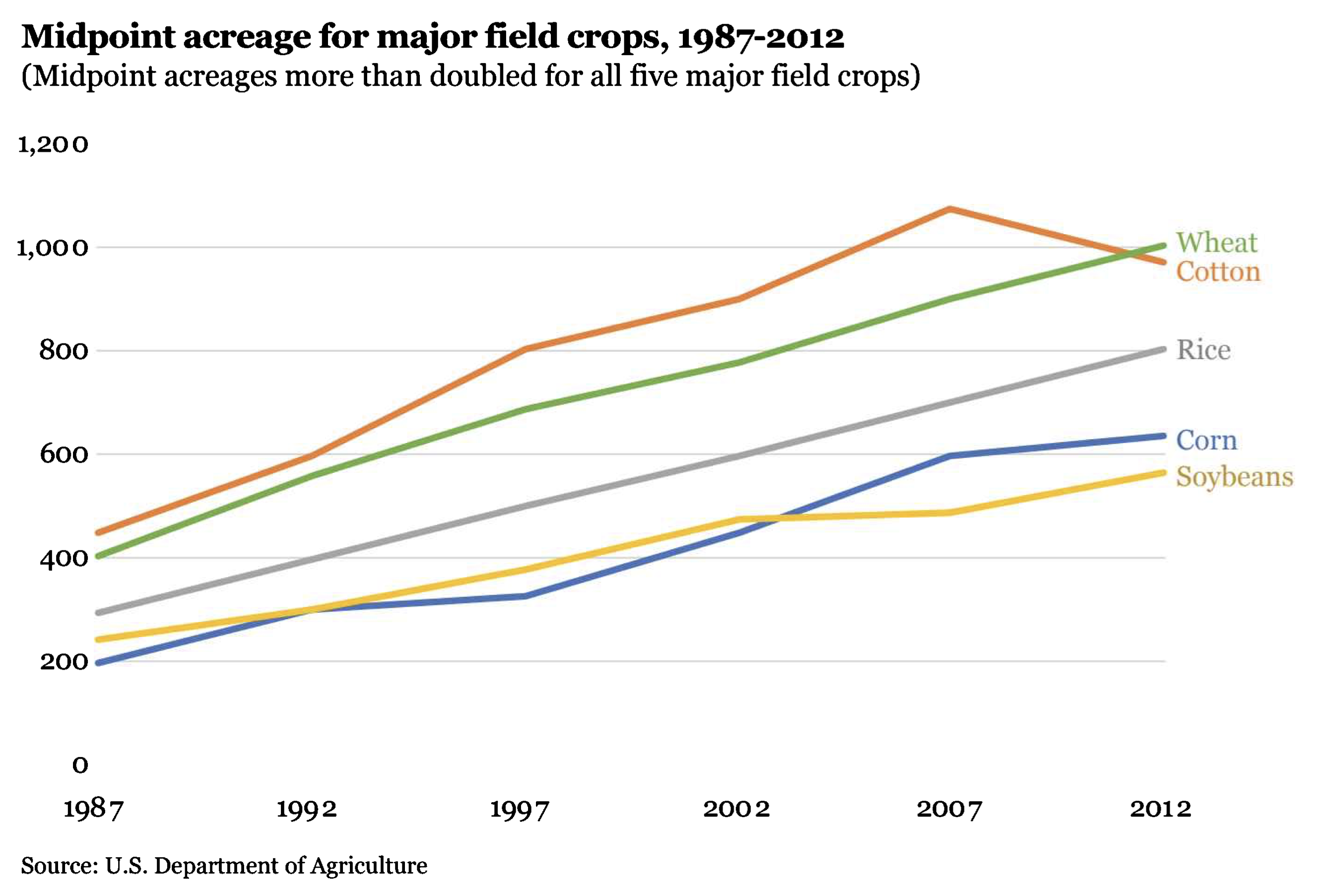
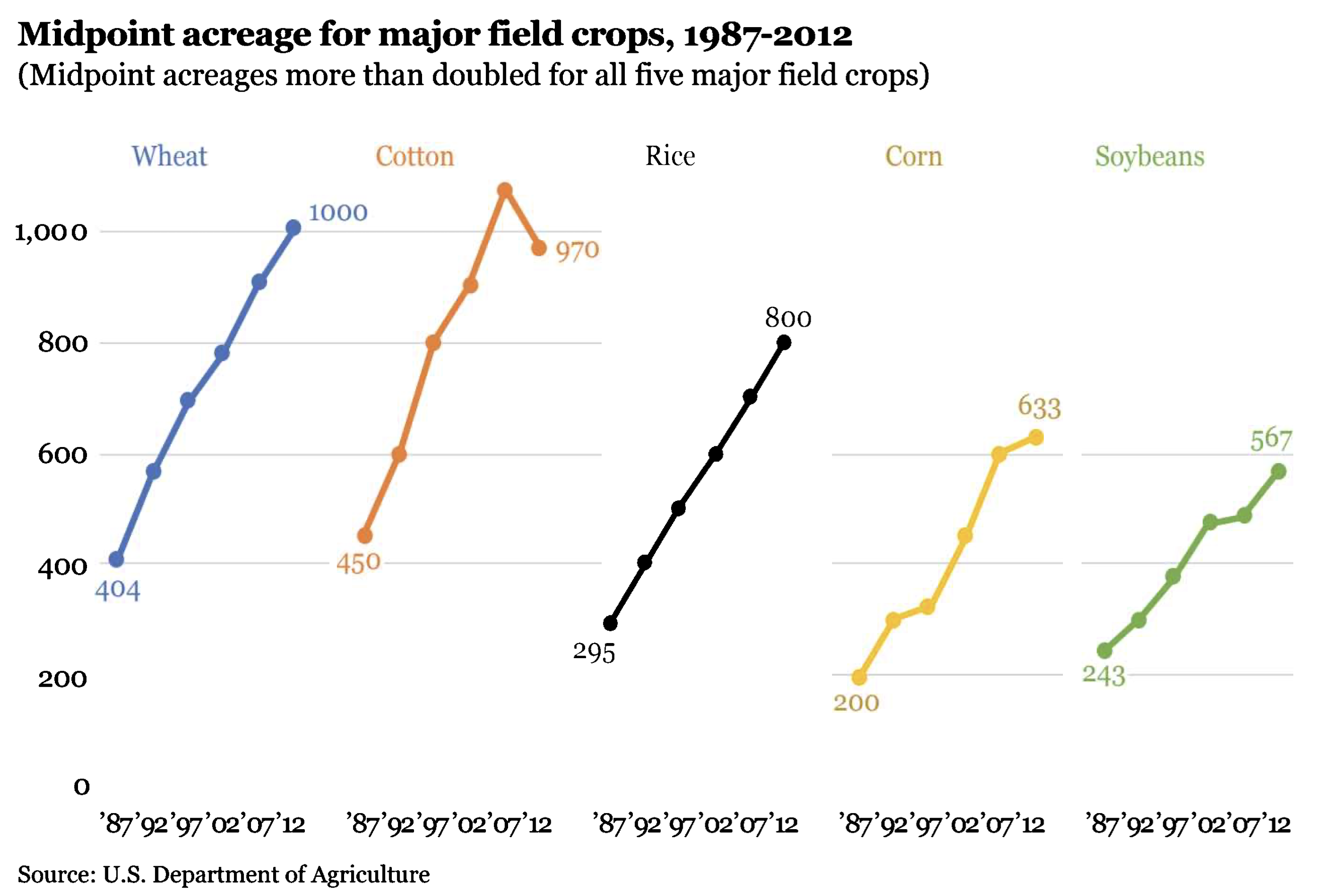
5. Avoid the spaghetti chart
Avoid figures that contain too much information.
The “spaghetti chart” is one such example, a line charts that look like spaghetti.
One solution is to convey less information. Only display what is vital.
If you have more information to convey, break one chart into smaller parts, ideally with identical formatting.
Spaghetti!
Better
Even better - what’s your point?

6. Start with gray
Whenever you make your graph, start with all gray data elements.
This will force you to be purposeful and strategic in your use of color, labels, and other elements.
When using R, Tableau, Excel, or really any program literally starting in gray would take some effort. But consider this a mental process…
Starting with color vs. gray

Strategically adding color
Connecting D3M, Data Storytelling, and Effective Visualizations
- The D3M process presents a structured approach to analyzing data.
- Data storytelling makes insights meaningful by adding context and a narrative.
- Effective visualizations enhance comprehension by reducing noise and focusing attention on key takeaways.
Review handout here
Objective 1 Review Question
Why use data visualizations instead of text?
Objective 2 Review Question
Which visualization?
Which vis do you like best?
Which vis do you like best?
Which vis do you like best?
Which vis do you like best?
A.
B. C.
Objective 3 Review Question
Which of the following steps should you accomplish before even starting your data visualization?
Start with gray
Show the data
Identify your objective
Construct an active title
References
Brynjolfsson, Erik, and Kristina McElheran. “The rapid adoption of data-driven decision-making.” American Economic Review 106.5 (2016): 133-39.
Dykes, B. (2019). Effective Data Storytelling: How to Drive Change with Data, Narrative and Visuals (1st edition). Wiley.
Harford, T. (2022). The data detective: Ten easy rules to make sense of statistics. Penguin.
Schwabish, J. (2016). Better Presentations: A Guide for Scholars, Researchers, and Wonks. Columbia University Press. https://policyviz.com/pv_books/better-presentations-a-guide-for-scholars-researchers-and-wonks/
Schwabish, J. (2021). Better Data Visualizations: A Guide for Scholars, Researchers, and Wonks. Columbia University Press. https://policyviz.com/pv_books/better-data-visualizations-a-guide-for-scholars-researchers-and-wonks/