Reading layer `tl_2022_us_primaryroads' from data source
  `C:\Users\lachenar\OneDrive - Colostate\Documents\GitProjectsWithR\csu-arec-330.github.io\materials\unit_03\week_03\tl_2022_us_primaryroads\tl_2022_us_primaryroads.shp'
  using driver `ESRI Shapefile'
Simple feature collection with 17389 features and 4 fields
Geometry type: LINESTRING
Dimension:     XY
Bounding box:  xmin: -158.1042 ymin: 17.97417 xmax: -65.64866 ymax: 61.57123
Geodetic CRS: NAD83Week 15:
Regression Analysis Example and Course Summary
Agenda
Project overview emphasizing connection between questions and analysis
Economics research example
Course recap
Project Overview
The Question: Your question for Project 3 should be formulated as:
What is the association between \(x\) (an explanatory variable) and \(y\) (some outcome)?
The Data: You will use the convenience store data (shopper_info, store_info, gtin) to select your \(y\), and choose one of the two additional datasets (census data or weather data) to choose your \(x\).
Option 1: Convenience store data combined with Demographic data from the US Census
Option 2: Convenience store data combined with Weather data from NOAA
How to succeed for Project 3
Review the lab notes from Week 14
Convey to us that you can turn your question into a model
Spend time interpreting your results
Understanding Gas Prices in Our Community:
A Town Hall Discussion
Presentation Components
Introduction, Question, Background
Data and Analysis
Discussion and Conclusion
1. Introduction, Question, Background
Introduction
Good evening. I’m Lauren, a local economic analyst.
We’re here today because the community needs to consider adding a new access road to Highway 101.
There is room in the town’s budget for infrastructure improvements, but there is a concern that developing new roads might lead to higher fuel costs.
Tonight, I’ll present to you analysis my team and I conducted on how gas prices vary with distance to the highway.
Decision Needed: To better understand the trade-offs involved with improving highway access so that you, the town planning committee, can decide to add a new access road.
Question
What is the relationship between gas stations’ proximity to the nearest highway and the price of gas paid by consumers?
Breaking Down the Question
What is the relationship between gas stations’ proximity to the nearest highway and the price of gas paid by consumers?
- Outcome: Price of gas
- Variable of interest: Distance between gas station and highway
- Unit of analysis: Convenience stores with gas stations
\(H_0\): There is no statistically significant relationship between distance and the price of gas.
\(H_A\): There is a negative relationship between distance to the highway and gas prices (i.e., as the distance decreases, gas prices increase).
I will use linear regression to test this hypothesis. If the coefficient on distance is statistically significant, I will reject the null hypothesis. (I also believe the relationship is negative…)
Why Does It Matter?
As we consider building a new access road to Highway 101, it’s important to understand the broader implications for our community—especially how it might affect gas prices.
If gas stations located closer to highway access charge more, then adding a new access point could inadvertently raise fuel costs for residents.
This analysis helps us weigh the potential economic benefit to consumers against the infrastructure costs, giving the town planning committee better information to guide your decision.
Concerns about re-routing the highway
- Could create more traffic for the town
- Could lead to an increase in gas prices (gas stations could charge a higher price due to proximity to the highway)
Benefits of re-routing the highway
- Shorter commuting time for residents
- Better-conditioned road which offers ancillary benefits
- More tax revenue from more gas sales
2. Data and Analysis
Analysis Plan
In order to answer our question: What is the relationship between the distance to the nearest highway and the price of gas paid by consumers? we need data on the following:
Location of gas stations (unit of analysis)
Price of gas (outcome variable)
Distance between gas station and the nearest highway (variable of interest)
These will serve as inputs into my linear regression model.
Data Collection
- Location of gas stations (\(i\))
- We gathered data on U.S. convenience stores with gas stations (
store_info)
- Price of gas (\(pr_i\))
- We also have data on the price per gallon of gas for all transactions during the month of July 2023 (
shopper_info)
\(\rightarrow\) Using these datasets, we filter out only the convenience stores with a gas station, leaving a sample of conveniences stores that sell gas and the price at which they sell it.
Data Collection
- Distance between gas stations and the nearest highway (\(Dist_i\))
\(\rightarrow\) For each convenience store with a gas station, we calculated the distance to the nearest highway and removed stores located further than 40 kilometers away (about 25 mi).
Summary Statistics
Below is a summary table of average prices per gallon and distances from the nearest highway for our sample of gas stations.
Table 1: Summary Statistics for Unit Price and Distance
| Mean | SD | Min | Max | |
|---|---|---|---|---|
| Price Per Gallon | 3.49 | 0.36 | 2.50 | 5.00 |
| Distance | 14.75 | 68.72 | 0.00 | 2,346.76 |
| N. Obs. | 6058 |
Aside: Here would be a great place to add my Tableau visualizations
Distribution of Unit Price and Distance
Figure 1: Matrix of density plots for unit price and distance
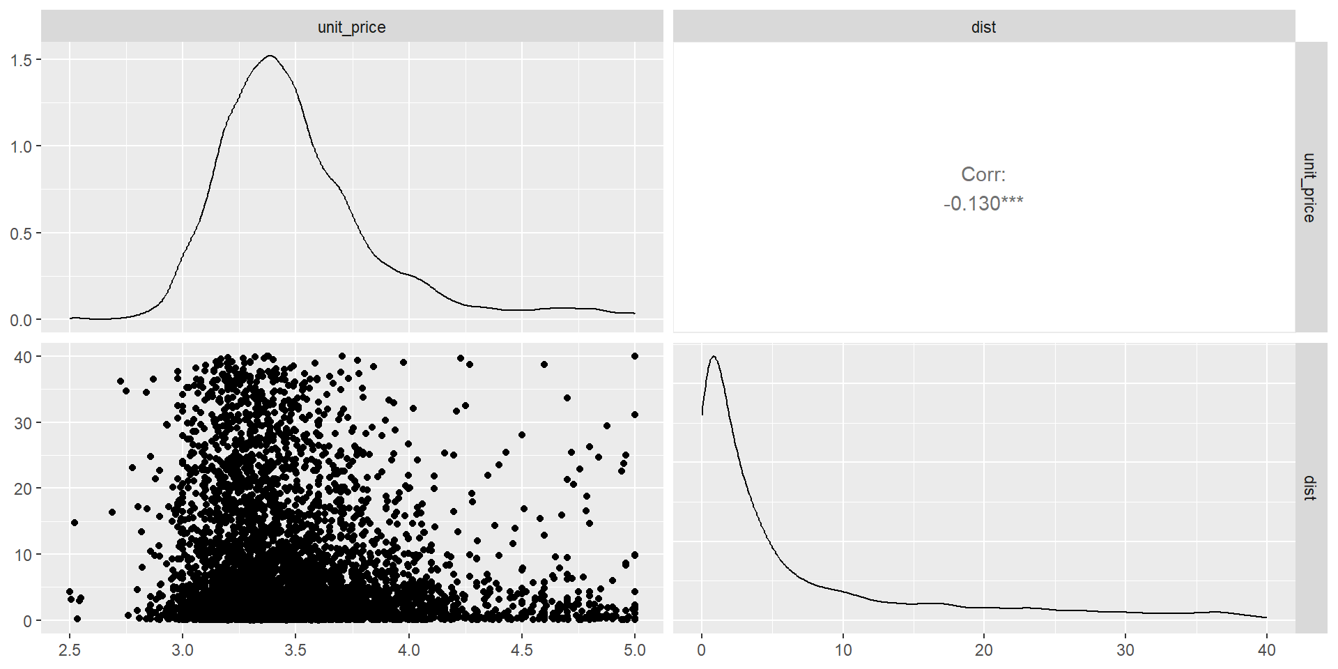
Unit prices appear to decrease as distance to highway increases
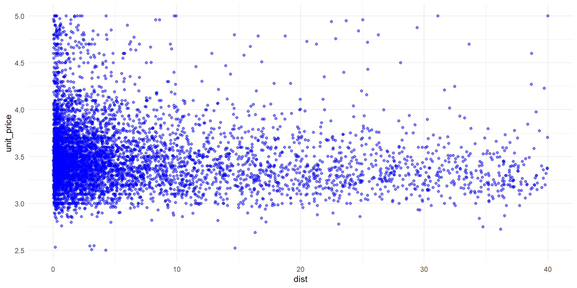
Figure 2: Scatter plot of unit price and distance
Univariate Regression Analysis
Although we can draw loose insights from the scatter plot, we use regression analysis to determine the relationship between distance and price.
\[ pr_{i} = \beta \cdot Dist_{i} + \alpha + \varepsilon_{i} \]
Outcome: price per gallon
Explanatory variable: distance to the highway (in kilometers)
Unit of observation: convenience stores with gas pumps
Univariate Regression Results
| term | estimate | std.error | statistic | p.value | conf.low | conf.high |
|---|---|---|---|---|---|---|
| (Intercept) | 3.5344093 | 0.0057473 | 614.96894 | 0 | 3.5231426 | 3.5456761 |
| dist | -0.0052381 | 0.0005133 | -10.20554 | 0 | -0.0062443 | -0.0042319 |
| R-squared | 0.0169076 | NA | NA | NA | NA | NA |
| Observations | 6058.0000000 | NA | NA | NA | NA | NA |
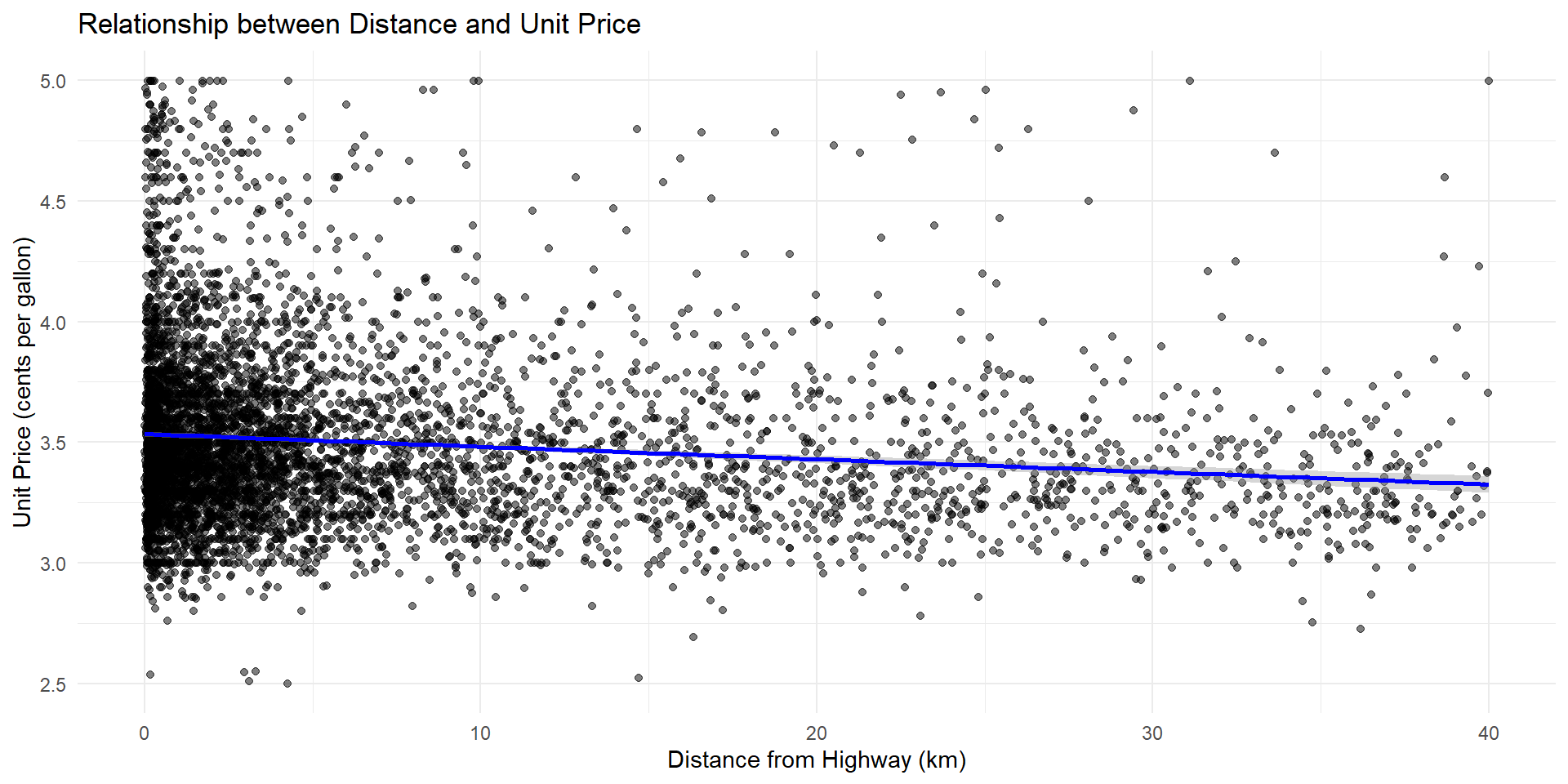
The coefficient on distance is statistically significant. Therefore I reject the null hypothesis in favor of the alternative.
Our analysis shows a clear trend—each kilometer away from the highway corresponds with a decrease in gas prices. (Refer to next slide.)
We also see that the \(R^2\) value is low at 1.69%, which suggests we should include additional variables.
For each additional km away from the highway, unit prices decrease by $0.005 cents per gallon
Figure 3: Scatter plot of unit price and distance, with line of best fit
Multivariate Regression Analysis
After adding additional control variables, we want to test if our results still hold.
\[ pr_{i} = \beta_1 \cdot Dist_{i} + \beta_2 \cdot X_{i} + \alpha + \varepsilon_{i} \]
Outcome: price per gallon
Explanatory variable: distance to the highway (in kilometers)
Additional control: number of gas stations within 5 kilometers (a proxy for competitiveness)
Unit of observation: convenience stores with gas pumps
Multivariate Regression Results
| term | estimate | std.error | statistic | p.value | conf.low | conf.high |
|---|---|---|---|---|---|---|
| (Intercept) | 3.5316728 | 0.0066272 | 532.9048492 | 0.0000000 | 3.5186811 | 3.5446644 |
| dist | -0.0051537 | 0.0005233 | -9.8489908 | 0.0000000 | -0.0061795 | -0.0041279 |
| count_within | 0.0012265 | 0.0014788 | 0.8293852 | 0.4069192 | -0.0016724 | 0.0041254 |
| R-squared | 0.0170192 | NA | NA | NA | NA | NA |
| Observations | 6058.0000000 | NA | NA | NA | NA | NA |
Although our model fit improved (1.7%), the p-value associated with the number of gas stations within 5 km is not statistically significant, so we cannot reject the null hypothesis that the coefficient is different from zero.
However, the coefficient on distance (\(\beta_1\)) remains statistically significant, suggesting the results are robust.
3. Discussion and Conclusion
Takeaways
Our analysis shows consistent results between distance and unit price-each kilometer away from the highway corresponds with a decrease in gas prices.
Adding a control variable that attempts to capture competition (number of gas stations within 5 km) does not explain variation in unit prices.
Assumptions and Limitations
Assumptions:
We assume that a gas station will locate along the new highway access road (once it is built) near the highway to attract traffic flow from Highway 101.
We assume that gas stations compete uniformly along prices of their grades of gasoline.
Limitations:
We use distance “as the crow flies” versus travel distance along the road.
We do not account for other confounding factors that could influence gas prices, such as the traffic flow on Highway 101 nearest to the town and distance to the nearest major metropolitan area.
Discussion
The pattern we observe (inverse relationship between distance and price) suggests that stations closer to the highway charge a premium for the convenience of being located near the highway.
For those commuting to work places outside of town, this might mean higher travel expenses.
Annual Economic Impact (on average)
What would the impact of a half-cent per km increase in gas price be on a typical household?
- Coefficient: $0.005 (per 1 KM) = $0.008 (per 1 MI)
- Fuel economy of a standard sedan: 30 miles per gallon
- Annual driving distance: 13,500 miles (US average, per FHWA)
How much more would a household spend on fuel if their nearest gas station is 3 miles closer to the highway?
Annual Economic Impact (on average)
- Change in price per gallon
- Assume 3 miles difference in distance to the highway:
- 3 miles \(\times\) $0.008 per mile = $0.024 (2.4 cents)
- Gallons used annually
- 13,500 miles / 30 mpg = 450 gallons/year
- Annual cost impact
- $0.024 \(\times\) 450 gallons = $10.80 per year
Conclusion
Our analysis confirms that distance from the highway is a factor related to gas prices in our community.
However, the considering the current travel cost to the highway without the access road, offsets the modest expected increase in gas prices.
As you prepare to vote tonight
Consider that building the access road could offer long-term savings for many households, even if prices near the highway remain slightly elevated.
Possible ways to balance these outcomes:
- Organize carpooling or shuttle programs to reduce fuel usage.
- Encourage local gas stations to adopt loyalty programs or price-matching to stay competitive.
Ultimately, this decision is about access, affordability, and how we support our community’s everyday needs.
Course Review: What was this course about?
Topics and themes
Effective and appropriate data visualizations
Data storytelling
Scripted data management and analysis (in R)
Organization
Time series
Cross sectional and spatial data
Regression analysis
What methods did we cover in these areas?
Our key takeaways from this course
Let the business or research question guide your analysis
Once you have something to say, develop a compelling story
Support your story with effective and appropriate visualizations