# This is the script for lab 07.

setwd("Set your working directory")

# Comment out the following line if you have already installed the forecast package.
install.packages("fpp3")

# Load necessary libraries
library(dplyr)
library(readr)
library(tidyr)
library(lubridate)
library(tidyquant)
library(forecast)
library(fpp3)Week 7 Lab: Forecasting and Prediction Intervals
This Lab Contributes to Course Objectives: 1, 2, 3, 4, 7, 8
Learning Objectives R
Understand the statistics of prediction intervals
Understand how to conduct a forecast with prediction intervals in R
Learning Objectives Tableau
Plot your prediction intervals
Using Tableau stories to present
Embedding Tableau in Powerpoint to present
R: Time Series Forecast and Prediction Interval
Review from last week
We built a forecast from time series decomposition components (Trend, Seasonality, and Residual).
We made some relatively simple assumptions about how these components would behave in the future.
This week, we will explore a different way to determine prediction intervals and quantify the uncertainty in our forecasts.
Introduction to fpp3
We will use the fpp3 package, which simplifies time series analysis by integrating several useful libraries that make time series analysis and forecasting much easier:
fable: Contains models for time series forecasting.feasts: Providesdplyr-like tools for working with time series data.
The library fpp3 was created as the companion to the textbook Forecasting: Principles and Practice (3rd ed).
The goal today is to look at prediction intervals, which are related to confidence intervals but pertain to your forecast.
Step 1: Load your data
First, set up your script (description, working directory, load packages).
We will continue using the carrot price data.
# Retrieve time series data
carrot <- tq_get(c("WPU01130212"),
                 get = "economic.data",
                 from="2007-08-01")
Step 2: Convert your data into a time series object
Like last week, we need to convert our data into a time series object. We will use a new type of dataframe called a tsibble.
ts() versus as_tsibble()
ts() creates a standard time series object in R, which is limited in flexibility for modern time series analysis.
as_tsibble() converts data into a tibble-like time series format, allowing for easier manipulation and compatibility with fpp3.
#Prep data
carrot_ts <- carrot %>%
  select(date,price) %>% # Select only the date and price variables
  mutate(date=yearmonth(date)) %>% # Convert the date into "yearmonth" format so the models understand the unit of observation
  as_tsibble() # Convert the data to a tsibble object. Similar to a tibble or data.frame but for time series data
Using `date` as index variable.This will create a new time series tibble object called carrot_ts.
Step 3: Build a forecast workflow
Our objective is to build a forecast model and extract the key pieces of information, so that we can export them to Tableau.
One of the benefits of the fpp3 package is that it simplifies model building process in a structure that is compatible with the pipe, %>%.
Recall the steps we followed in week 06’s lab1:
Decomposed the carrot price time series into
trend,seasonal, andrandomcomponents.Built a forecasting model based on each component. We defined individual forecasts for each of the three components. We used the function,
forecast, to forecast each component separately.2Put them back together.
We will translate the workflow we built into the structure of the new package. This process is called a workflow: A set of steps for completing a task.
Part 1: Define the model
We have the time series data, carrot_ts, prepared for modeling. Now, we need to define the model.
Let’s fit an Exponential Smoothing (ETS) model, specifying that trend, seasonality, and error components should be additive:
# Define the model
fit <- carrot_ts %>%
  model(my_ets = ETS(price ~ trend(method="A") + season(method="A") + error(method="A"))) # Fit model
The function model() is used to define the forecasting model. In this code, we have done the following:
Defined an exponential smoothing model,
ETS(), based on three components:trend,season, anderror.Told the model that we want those components to be additive rather than multiplicative. (The argument
method="A"represents additive.)We have defined the model as
my_ets.
In short, this defines the model that we built in parts in week 06.
Inspecting the data frame fit shows us that this simply defines the model but doesn’t do anything with it.3
Note
model() is a powerful function capable of specifying many models at once. You may want to compare model fits or estimate models on several price series simultaneously. See more information here.
Part 2: Generate a forecast
Now that we have specified the model, we need to run the forecast.
We will use a function called forecast() BUT we want the forecast() function from the fabletools library (related to fable).
Different versions of
forecast()
The forecast() function in fabletools is different from the forecast() function from the forecast package. When functions share the same name across different packages, you can specify the library explicitly (e.g., fabletools::forecast()) so R does not try to use the wrong one.
In forecast::forecast(), we must specify the horizon (h) using the same time units as our data. Since our data is monthly, a 5-year forecast requires h=60 (because 5 years × 12 months = 60).
In fabletools::forecast(), the function automatically recognizes the time units from the tsibble object. Instead of manually converting to months, we can simply write h="5 years", and it will handle the conversion.
This makes fabletools::forecast() more intuitive and easier to use when working with time series data in fpp3.
We will specify that we want to forecast our ETS model for 5 years.
# Generate forecast
carrot_forecast <- fit %>%
  fabletools::forecast(h = "5 years") # Forecast model for 5 years
Inspect carrot_forecast and you will see that it contains mean price (called .mean) and prediction intervals (price) for each month of the 5-year forecast.
Part 3: Visualize the forecast
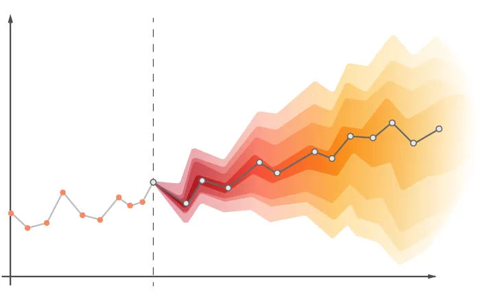
To visualize the forecast alongside the actual data, you can pass carrot_forecast into the function autoplot() which understands how to read forecast output. Note that autoplot() plots only the forecast by default. Adding the observed data carrot_ts tells the function to include the observed data in the plot.
# Plot the forecast
autoplot(carrot_forecast, carrot_ts)
The plot includes the mean forecast, the 80%, and the 90% prediction intervals.
A note about
autoplot() arguments
The order of arguments in autoplot(carrot_forecast, carrot_ts) is intentional because:
Forecast first:
carrot_forecastcontains both the predicted values and the prediction intervals. By placing it first,autoplot()ensures that the forecasted values and confidence intervals are drawn before the actual time series.Observed data second:
carrot_tsis the historical data. Adding it second ensures it overlays correctly on the forecast, providing a clear comparison between past observations and future predictions.
See Hyndman and Athanasopoulos for more information on developing a workflow with these time series tools.
Step 4: Extract prediction intervals
The plot generated by autoplot() indicates that the model is estimating prediction intervals.
To extract prediction intervals from the forecast object, use hilo() from the fable library. This function stores intervals in a compact format, so we must unpack them (i.e., change them from a single variable, currently called price, to two separate variables called upper and lower).
There are two options to separate the min and max of the 95% confidence interval:
Option 1: Use unpack_hilo()
Specify the name of the variable; in this case "95%".
# Extract 95% prediction interval
carrot_forecast_pi <- carrot_forecast %>%
  hilo(level = 95) %>% # Extract 95% prediction interval
  unpack_hilo(cols = "95%") # Unpack into own columns named lower and upper
Option 2: Use mutate()
Alternatively, extract intervals manually using mutate():
# Extract prediction interval manually
carrot_forecast_pi <- carrot_forecast %>%
  hilo(level = 95) %>% # Extract 95% prediction interval
  mutate(
    "95%_lower" = `95%`$lower,
    "95%_upper" = `95%`$upper
  ) # Generate own columns named lower and upper
Difference between
forecast and fabletools prediction intervals
The key difference between the prediction intervals in this lab and those from the forecast() function in the forecast package last week is how they are generated and what assumptions they make:
Last Week (forecast() from forecast package):
- Used classical decomposition with separate forecasts for trend, seasonality, and residual components.
- The prediction intervals were derived from individual component forecasts, which were then summed to get the final forecast.
- The intervals were typically based on assumed normality of residuals and used a fixed standard error estimate.
This Week (fabletools::forecast() from fpp3):
- Uses an Exponential Smoothing State Space Model (ETS) directly on the time series data.
- The prediction intervals are generated from the model’s inherent error structure, which accounts for uncertainty in a more integrated way.
- This approach better reflects how errors accumulate over time rather than summing separate component forecasts.
Takeaway:
The fpp3 approach provides a more statistically robust way to estimate prediction intervals by treating the forecast holistically, rather than adding separate component forecasts.
Step 5: Export data for Tableau
Finally, we want to prepare the data for export to Tableau.
Recall that our original time series data, carrot_ts, has two variables: date and price.
Our tsibble carrot_forecast_out has date and price, but the price variable is a distribution rather than a value. The variable .mean contains the forecast mean, so we can remove price and rename .mean. Remember that you can rename and select variables in the same command.
# Prepare data for export
carrot_forecast_out <- carrot_forecast_pi %>%
  select(date,
         price = .mean,
         lower = "95%_lower",
         upper = "95%_upper")

to_export <- bind_rows(carrot_ts, carrot_forecast_out)

write_csv(to_export,"carrot_forecast.csv")
Lab Script for Week 7: Forecasting and Prediction Intervals
# This is the script for lab 07.

setwd("Set your working directory")

# Comment out the following line if you have already installed the forecast package.
install.packages("fpp3")

# Load necessary libraries
library(dplyr)
library(readr)
library(tidyr)
library(lubridate)
library(tidyquant)
library(forecast)
library(fpp3)

# Retrieve time series data
carrot <- tq_get(c("WPU01130212"),
                 get = "economic.data",
                 from="2007-08-01")

#Prep data
carrot_ts <- carrot %>%
  select(date,price) %>% # Select only the date and price variables
  mutate(date=yearmonth(date)) %>% # Convert the date into "yearmonth" format so the models understand the unit of observation
  as_tsibble() # Convert the data to a tsibble object. Similar to a tibble or data.frame but for time series data

# Define the model
fit <- carrot_ts %>%
  model(my_ets = ETS(price ~ trend(method="A") + season(method="A") + error(method="A"))) # Fit model

# Generate forecast
carrot_forecast <- fit %>%
  fabletools::forecast(h = "5 years") # Forecast model for 5 years

# Plot the forecast
autoplot(carrot_forecast, carrot_ts)

# Extract 95% prediction interval
carrot_forecast_pi <- carrot_forecast %>%
  hilo(level = 95) %>% # Extract 95% prediction interval
  unpack_hilo(cols = "95%") # Unpack into own columns named lower and upper


# Prepare data for export
carrot_forecast_out <- carrot_forecast_pi %>%
  select(date,
         price = .mean,
         lower = "95%_lower",
         upper = "95%_upper")

to_export <- bind_rows(carrot_ts, carrot_forecast_out)

write_csv(to_export,"carrot_forecast.csv")
Tableau: Plotting prediction intervals
Using the data we exported from R, we will plot the prediction intervals.
Option 1: Simple line graphs, no shading
Connect to the
carrot_forecast.csvdataset you just exported from R. Make sure that thedatefield is correctly recognized as a date in Tableau.Create two new calculated fields. One called
Observed Priceand one calledForecasted Price. You can create both of these using an IF THEN ELSE statement:
Observed Price: We want all prices through the end of our observed data (determine the end date of our data). For example, if the observed (i.e., actual) price series ends on January 1, 2025, then the calculated field would be expressed as:
IF [Date] <= #January 1, 2025# THEN [Price] ELSE NULL END
Forecasted Price: We want all forecasted prices in a separate calculated field. For our example, these would be prices after and including February 1, 2025:
IF [Date] > #January 1, 2025# THEN [Price] ELSE NULL END
Note: Do you get any error messages when you try to create the two new calculated fields? What do you need to do to fix the error?
- Create a line chart that includes
Observed Price,Forecasted Price,Upper, andLower.
Note: There are two more modifications you need to do before you can plot Upper and Lower. What modifications do you need to do?
- Change the colors to something useful. Use the same gray shade for both upper and lower.
Option 2: Adding shading
Duplicate your previous worksheet.
In the Marks card, change your chart to an Area Chart.
Unstack your lines by going to Analysis -> Stack Marks -> Off
Rearrange the order of your forecast and prediction intervals in the Measure card: Lower, Forecasted, Observed, Upper.
Change your colors: White for
Observed PriceandLower, Gray forUpperandForecasted Price. Make sure the opacity is set to 100%.Create a new line graph by dragging the original
Pricefield to the Rows Shelf.Change this new pane to a line chart.
Change the colors to reflect forecasted and original prices by creating a new calculated field that equals “Forecasted Price” after January 1, 2025, and that equals “Observed Price” before then. Drag this calculated field to the Colors Card
IF [Date] <= #January 1, 2025# THEN "Observed Price" ELSE "Forecasted Price" END
Combine your charts by creating a dual axis. Right click the Y-axis of the Price line graph -> Select
Dual AxisSynchronize your axes. Right click the second Y-axis -> Select Synchronize Axis. You can then hide this axis. Right click -> Click Show Header to de-select it.
Notice that the area under the Price line no longer has your y-axis grid lines. Let’s get rid of all the grid lines to make this look a bit nicer.
- Right click on your chart -> Select Format. In the format pane, navigate to the lines icon, change Grid Lines to None.
- Finally, go back to your last sheet. Notice that the colors between your sheets are linked. Tableau does this to ensure your sheets are cohesive, but sometimes we want different colors for the same variable. The workaround for this is to duplicate each of the variables you want to assign a different color and use those in this sheet instead of the original variables.
Presenting in Tableau
Option 1: Stories
Tableau Desktop includes its own method for presenting your analyses. These are called stories. This tutorial will show you how to put together a simple story.
Create a new story by clicking the New Story tab at the bottom of the window. Change the size to PowerPoint.
Create an Intro slide with text by creating a new Dashboard. Add a background image and a text box.
Add your Intro slide to your story.
Add a new (blank) story point and bring in one of your worksheets. Give this story point a useful title.
See what your story looks like in presentation mode. Note that you can hide the story title to make this look a bit nicer.
Note that if you like the formatting features of PowerPoint for text slides, you can also create these slides in power point, export them as images and then add those images to Dashboards.
Option 2: Embed in Powerpoint
You can also embed interactive Tableau dashboards from your Tableau Public account directly into PowerPoint. This will require you to install the Web Viewer Add-in. Follow these instructions to set this up: Watch this Video or Read this Blog Post
Now get together with your teammate and spend some time on your project!
Footnotes
Refer back to these lab notes↩︎
Specifically,
forecast()uses an exponential smoothing method by default.↩︎You can extract model coefficient estimates using the command
tidy(fit)if you need to extract them.↩︎